25 January 2011

Let's rethink wallpaper


This wallpaper from Thibaut has me reconsidering wallpaper.
I'd love to use this wallpaper in a very masculine room, like maybe in my library.

The discussion came about because of our noise problem.

This entry hall and


this family room that have high ceilings and one sofa,  have a reverberation problem at the moment.
I am hoping that by adding more furniture this will lessen.

My husband had the idea of adding grasscloth wallcovering,
 first to my youngest daughter's room to add texture.
 I agreed and thought that it was also a bit sophisticated instead of the obvious juvenile look.

Then the conversation moved on to our family room.
I sprinted to my computer and found this sisal wallcovering on Thibaut's site.
It comes in four colorways.
Then I found the Bankun Raffia in 15 colorways including this bold Cranberry.


These two leather looks and an ostrich leather had me intrigued.


Even their grasscloth is not boring. I love this Kunqu Damask.

Thibaut's grasscloth resource offers a variety of looks in grasscloth, including metalic, multicolored, and traditional natural looks.
Click HERE to view all of their collections.

24 January 2011

Virginia via Instanbul


This photo from House Beautiful Istanbul is the handiwork of a designer in my new hometown.
Judith Minoff is no small town girl. Her designs for the heads of multi-national companies have made news and she is now in Fredricksburg, Virginia.

The classical elements and nearly white walls let the architecture and a few choice peices do the speaking.

Lovely.
I find her mix of high and low with ethnic, Federal, and Victorian very satisfying.
Take a look HERE.

16 January 2011

Sunday sanity


Back in the day, my boyfriend (now husband) and I used to invite my neighbors and good friends over every Sunday for Bloody Marys. Occasionally, we would have several and a martini too.
Those days are over but a great Bloody Mary can be hard to find unless you are at home.
This is my version--everything is to taste so no real amounts.


Start with an iced glass and a healthy (1 1/2 to 2 oz.) shot of vodka.
I sprinkle celery salt, Old Bay seasoning, black pepper- freshly ground, and an optional drop of Tabasco onto the ice.


I then dribble in Worchestershire sauce, only Lea and Perrins for me, and finish off with V8 juice. I use it because many tomato juice brands are sweetened lightly and I don't like that.

Add a celery stalk and a wedge of lime if you like.
Stir.


Savor.

14 January 2011

Its obvious

Last week I took a drive to Pottery Barn in Richmond. I was looking for a couch but found myself liking their antique style serving peices until I noticed the engraving on them.

Forks that say "Fork" and pitchers that say things like "Pour" and "Drink" on them seemed really stupid to me.

After I returned home, I began rummaging through my collection of antique silver and hotel-silver and it dawned on me that the most ornate Victorian pieces often have an obvious motif.

Like this berry spoon with embossed berries in the bowl.

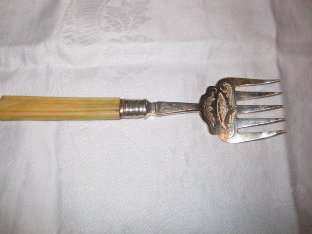
This fish fork with a fish.


These forks are of different sizes as would be appropriate for different size fish. The flat, spatulate design of the tines is for delicately removing the fish from the bones to serve it.


These spoons are for sugaring berries as opposed to scooping them up like the ones without holes.


This baby spoon reads, of course "baby" and because it was my grandfather's I happen to know that the gift giver was being impatient by not waiting to find out the baby's name and not obvious.

Not all of these items have obvious motifs but they do have in common beautiful engraving.


Meg, at Pigtown*Design did a post on similar engraved Victorian silverware including some marvelous fish knives that are for sale in her Etsy boutique.


11 January 2011

New Year --New Look a bit late...


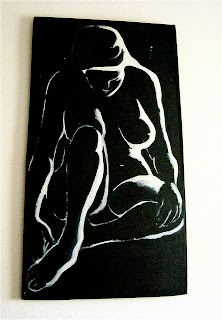
I suppose that image is misleading since I just wanted to honor my grandparents this year.
The painting above was done by my grandmother, Elisabeth " Lysie" Iddings, who taught art and art history to me and countless other students.


As were these and te new blog header image that I have chosen.

I owe much thanks for my past and present circumstances to my grandparents and their unending devotion to my education and happiness has made me who I am today.

10 January 2011

Doric columns, Aaaagh!


This is the view from the dining room in my house into the formal living room. The front door is just to the left.
I hate the carpet but we're stuck with it for the moment.


This is the view into the dining room. It has lovely paneling and chair rail which stops at the dining room side edge of these stupid Doric column room divider.

The dilema is that I would like to have the rooms different colors.


I would like my dining room to be this color (SW6601 Tanager) the color of my old living room.
I'm going for the full-on-Ralph Lauren-equestrian-chic look.
I would like the living room to be a very pale creamy yellow like this, although my browser turns into an awful insipid mess.

It is actually a pale yellow leaning toward the red side of the wheel not green.

The trouble is how do I create the dividing line?
I thought of turning it into built ins-- the husband says its not gonna happen.
 My other option is a pilaster against each wall ending the chair rail and lining up with the columns.


Like this.
Suggestions?


07 January 2011

Love this


I love everything about this room.
Generally, my eye goes to the window treatments after a once over.
The cornices flow with the ornate fireplace here and the neutral drapes are something I would choose for my own home.

I am not hugely in love with sectionals but the gray velvet and honeysuckle pillows are making me rethink my color scheme in my family room.
Lastly, I must have that coffee table!