29 July 2011

How many circles can you find?

Antique coffee grinder lamp

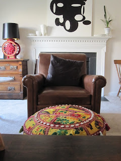
This isn't exactly about an "I Spy" for circular shapes just about a theme, unintentional at first, that I have incorporated in my family room.
 It seems that there are circles everywhere.


This view says it all to me. You see the 2 year-old who must be considered in every decorating decision in this room. Notice the empty table tops? Notice the kinda ugly coffee table? I'm just not not giving her the option to destroy and saving myself some stress. Also part of my art collection is in view here so I get to have a few things I love too.


In this view you see the drapes hung, finally! Alas, we have not hung the bamboo shades under them yet. I have a problem with the way they hang I need to quit being lazy and iron out the crease from when they were hanging folded. Also, the rod pocket is too big which puzzles me but I won't get into that here.
Back to circles. We have one long sofa and the vintage club chair that I grin and bear for the moment. I wanted more casual seating but not a chair. Moroccan poufs are big right now but I honestly don't like them, I think its the pattern in the leather on top that rubs me the wrong way.
So I ordered a pair of Indian poufs from Overstock. I thought they'd add more texture, repeat the circular motif, and add some unexpected, funkiness. Oh and they were a steal $120 for the pair.


Problem #1: They are significantly larger than the measurements given online so two of them take over the room--not OK.
Problem #2: My entire family hates it/them. I left the other one in its packaging and I'm debating selling it on eBay.
I can't really return them both because one has been used and I sort of like it depending when you ask me. I'm definitely waffling about this one.
The pros are that its a wonderful footstool, toddler friendly, big enough for an adult to sit on comfortably, and absolutely funky.
But is it too college dorm hippie/patchouli/ambivalent on bathing in its feel? Or just unusual texture?

What do you think?

26 July 2011

what i know and love about art #1

My Meme (grandma~French)
Art came to me as soon as milk. I lived with my Meme (grandmother) and she taught,made, and lived her art. I first remember a painting affecting me at approximately age three. I was hanging out in a class that she was teaching and  thumbing through an art history tome.  I fell in love with ...
 Botticelli.
For those of you who think I'm making this up, my parents have told me that I was oddly calm as a youngster. 
So it goes that I asked many questions about the motifs in "The Birth of Venus" . I wondered why men were blowing at her--they were the wind. And "why are ladies in flowered dresses giving her clothes? Is she cold from the wind? No, they are les Printemps, (the Spring)  and they are clothing her in the beauty of nature because she is naked.
Why is she naked?
Well, let's just say it was onto something else at that point. The Catholic quiet kicked in and it was bedtime!!
That is the small part of the story. In 1984, when I was 16, I spent a second summer in Europe, this time with Fairfax County schools. I had the choice of England + another country. I chose Italy because it was the smallest group, only 9 of us.
It is insufficient to tell that upon elevator doors at the Ufizzi in Florence I became weak kneed.
There it was. 
So much bigger than I ever imagined!!!
I hid tears from my classmates.
How had I missed in my studies the real scale of it?
I had a rush of so many feelings at that moment.
This is still a special image to me, for its many revelations. I think that so many people want to match their art with their decor and they should match it to their feelings both good and bad.
A search for art is as search for self and should feel like one, however uncomfortable.

25 July 2011

Copy India Hicks style


Many of us would love to stay in India Hicks' magnificent Bahaman rental, Kings"s Treat.
The lovely island feel of one particular piece can be found in a very unlikely place.

This similar chair can be found in the Home Decorator's catalog, known for discount furniture and rugs.
I hardly think Ms. Hicks shop there.

24 July 2011

Kravet and a project in my furture

T-J Toile is a sensational looking fabric from Kravet depicting many of Thomas Jefferson's buildings. Being a Virginia native and TJ fan overall, this held real appeal for me so I spent a good deal of time searching for a non-blue colorway to no avail. The blue is lovely and authentic blueprint color but I don't see it fitting in with my decor anywhere.
I searched for other architectural prints only to be disappointed.
I took matters into my own hands.

At first I had an idea to buy an antique (pre-1800) map of Virginia 

to create my own Spoonflower.com fabric because I saw one several years ago that has been on my mind since. Everything was too expensive for me so I bought architectural prints--lots of them!


 So many goodies.
 

The first Temple of Minerva print I bought singly
and then I found this lot of 64. Jackpot!
The ones that I don't want I will most likely resell in my, now empty, Etsy store.

 Can't wait to create my own architectural toile in a more subdued colorway.

I hope it works.

22 July 2011

library day

Alessandra Branca
When I was in grade school I couldn't wait for library day. I still love books and together with my husband, have amassed quite a collection.
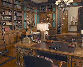
Today I am meeting with a contractor about my plans for a library in my home--Yay!

I am just dying to get all of those boxes unpacked and out in the light of day.


I am thinking of having the tops arched as in the photo above.


I am going for a dark, moody, masculine space.


I am already thinking about how to style the shelves.
 I will not organize by color of the book spines.


I prefer a more organic arrangement.


The walls will be painted Chinese red so I need to decide on a paint color for the shelves.
I am leaning towards black...
just like this Alessandra Branca library that is my main inspiration.
Which would you choose?

20 July 2011

Join me in my addiction, won't you?

Marrakesh table
I feel compelled to look at every side table on the internet these days.
I saw the "Marrakesh" table on Lonnymag.com and it was a different table. It was $250 and I almost bought it.

Moro table


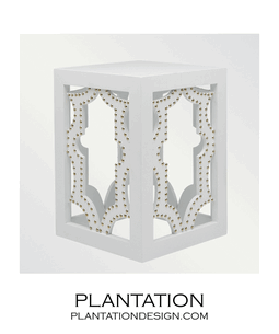
It was similar to this "Moro" table but white and I felt I had to have it.
It is probably best that Lonny made it so popular that it went away but I keep going back to Plantation's side table page.
Linked table

Can you blame me? I just fantasize about where I could put them.
Corinth table
This Corinth table would make a lovely bar.
Lookout table
I thought the Lookout table was wood but it is bronze. I'll keep it in my mental file as a stylish, kid-proof option for someone.
Sigma table
I love this one too.
West elm table
This $129 number from West Elm has my attention as well.
And just to end on a weird note...
Bazaar tables
These fabric wrapped nesting tables at Urban Outfitters seem impractical. How would you wipe up a spill? I guess the college set embraces the patina of filth. Maybe they meant "bizarre" tables.
Urban Outfitters does have some cute furniture that is not so boring although I can't speak to the quality.

I really don't need another side table, although I have a spot for one, I must stop filling every empty spot in my home.

19 July 2011

Why?

not my photo

Why do so many people buy HUGE, ugly, overstuffed furniture and cram it into a normal size room?
Yesterday I ventured across the street to fetch a tray left behind after the 4th of July and see my neighbor's new basement renovation. I am on the hunt for a contractor to build my library shelves and wanted to check out the workmanship.
I couldn't exactly say, "let me take some photos and criticize it on blog" so use your imagination.
The space plan was awkward, perhaps because of the plumbing and framing already in place. You walked in as through a backstage door, behind the wetbar to the room beyond and behind the theater seating in the screening room. All were filled with what I call "naked fat people furniture". You know what I mean, the overstuffed leather that reminds me of rolls of fat.
The tiny bedroom had a queen size bed and a dresser so large that it hulked over the bed in a very unwelcoming manner.
not mine either, just illustrating a point

The problem is that these are very nice people that I will be living near for many years to come and the asked me for some decorating advice. It is all brand new, so my get rid of it and start over won't fly.
My strategy is to keep my mouth shut and pray that they don't ask for any more decorating help.

18 July 2011

Bargain of the week


This garden seat was a steal at around $80 from Overstock.com. I saw a similar one over the weekend for $235 in a D.C. boutique.
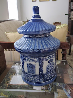
At the moment it is just a place holder in a bare spot of my entry hall that is filled with chinese blue and white porcelain.

It might be moved sometime in the near future. 
The adjacent living room and bath sport their own bits of blue and white.

Did you score any weekend bargains?

10 July 2011

A fascinating old friend and her unique home

 I was returning to Central Virginia after bundling off the older kids to their grandparents and a vacation in Maine and on a whim I decided to exit the highway and take a spin through my grandparents old neighborhood. I lived there with my parents, grandparents and uncle in their larger house until I was two. When I was fifteen they moved into a smaller house across the street, more about that later.
To my surprise as was driving by their house on the verge of tears, I spotted their long time neighbor and friend, Miss Vivian, as she was known to me. I called out to her and she invited me in and we chatted about art and my family, who she misses.
She is a fascinating woman that I have known most of my life and an artist, now at the prestigious Torpedo Factory. Her style is impeccable  and her taste exquisite. She's had grasscloth wallpaper in her entire house since the '70s.

The finest Oriental carpets with a Noguchi table


a white slipcovered sofa and two brown Wassily chairs. She is not a trendy person...


she has had them forever. This is all paired with fine Asian antiques and a stunning, floor to ceiling art collection. All contained in a surprisingly modest home.
Which leads me to the second subject of this post. She lives in a Lustron home, like my grandparents did.

About 2,680 of these porcelain-steel  homes were produced in America between 1949 and 1950 by the Lustron Corporation in Columbus, Ohio.They cost about $10,000 - not including the lot.  The homes were shipped on a flatbed and required 350 man hours to assemble. Most were built on a concrete base. The porcelain coated exterior panels came in four colors: 'Maize Yellow', 'Dove gray' 'Surf Blue' and 'Desert Tan'.

As you can see from the floorplan, They are not the McMansions of today. 
All interior panels were of the porcelain steel which meant a commitment when it came to hanging pictures!

My grandparents only replaced the counters in the kitchen and removed the upper cabinets that separated the kitchen from the dining area. Miss Vivian has painted hers in vertical gray, ivory and beige stripes.

This is the Lustron living room. It speaks to a different generation's idea of comfortable living.
My grandparents put a mirror in the alcove behind the sofa, Miss Vivian has closed hers off and covered every inch with art.

Read more about this unique and disappearing bit of American architecture HERE.

08 July 2011

Founding Father's Chinoiserie


Gunston Hall is an 18th-century Georgian mansion near the Potomac river in Virginia. It is the home of founding father George Mason.


It's Chinese room offers a unique look at 18 th century fashion and taste that is a close cousin of current Chinoiserie fashion.

 
The Federal style dentil molding is coupled with Chinese-esque motifs.


Note the pagoda shapes around the room.


It is particularly interesting to me that we were taught through films and other history lessons to think of colonial American decoration in terms of staid, conservative colors when in fact very vibrant colors were the norm.
Lack of differentiation between paints on the walls and molding and the absence of softs, i.e. curtains and carpet, are the most noticeable details that set it apart from contemporary rooms.
The lemony yellow color works nicely with the blue and white china.
 
I'd kill to have a dining room like this, wouldn't you?