14 January 2011

Its obvious

Last week I took a drive to Pottery Barn in Richmond. I was looking for a couch but found myself liking their antique style serving peices until I noticed the engraving on them.

Forks that say "Fork" and pitchers that say things like "Pour" and "Drink" on them seemed really stupid to me.

After I returned home, I began rummaging through my collection of antique silver and hotel-silver and it dawned on me that the most ornate Victorian pieces often have an obvious motif.

Like this berry spoon with embossed berries in the bowl.
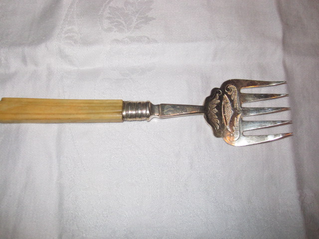
This fish fork with a fish.


These forks are of different sizes as would be appropriate for different size fish. The flat, spatulate design of the tines is for delicately removing the fish from the bones to serve it.


These spoons are for sugaring berries as opposed to scooping them up like the ones without holes.


This baby spoon reads, of course "baby" and because it was my grandfather's I happen to know that the gift giver was being impatient by not waiting to find out the baby's name and not obvious.

Not all of these items have obvious motifs but they do have in common beautiful engraving.


Meg, at Pigtown*Design did a post on similar engraved Victorian silverware including some marvelous fish knives that are for sale in her Etsy boutique.


11 January 2011

New Year --New Look a bit late...


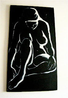
I suppose that image is misleading since I just wanted to honor my grandparents this year.
The painting above was done by my grandmother, Elisabeth " Lysie" Iddings, who taught art and art history to me and countless other students.


As were these and te new blog header image that I have chosen.

I owe much thanks for my past and present circumstances to my grandparents and their unending devotion to my education and happiness has made me who I am today.

10 January 2011

Doric columns, Aaaagh!


This is the view from the dining room in my house into the formal living room. The front door is just to the left.
I hate the carpet but we're stuck with it for the moment.


This is the view into the dining room. It has lovely paneling and chair rail which stops at the dining room side edge of these stupid Doric column room divider.

The dilema is that I would like to have the rooms different colors.


I would like my dining room to be this color (SW6601 Tanager) the color of my old living room.
I'm going for the full-on-Ralph Lauren-equestrian-chic look.
I would like the living room to be a very pale creamy yellow like this, although my browser turns into an awful insipid mess.

It is actually a pale yellow leaning toward the red side of the wheel not green.

The trouble is how do I create the dividing line?
I thought of turning it into built ins-- the husband says its not gonna happen.
 My other option is a pilaster against each wall ending the chair rail and lining up with the columns.


Like this.
Suggestions?


07 January 2011

Love this


I love everything about this room.
Generally, my eye goes to the window treatments after a once over.
The cornices flow with the ornate fireplace here and the neutral drapes are something I would choose for my own home.

I am not hugely in love with sectionals but the gray velvet and honeysuckle pillows are making me rethink my color scheme in my family room.
Lastly, I must have that coffee table!

06 January 2011

Happy Anniversary to me!!


It snuck up on me. This the one year anniversary of my first blog post .
I have had a few changes in my world.


The happiest was our move to Virginia.
I am hoping the year ahead is inspired and full of interesting goodies to add to this blog.

04 January 2011

Finding design inspiration

Finding design inspiration is not always as obvious as grabbing the nearest shelter magazine and copying the elements that you like best.

Often the architecture dictates what you can copy.
The best designs evolve from one or more sources like...

image via Thibaut


a fabric or wallcovering that that has the colors and mood that resonate with you.
Non -designers can have a very dificult time translating an inspiration peice into a functioning room without resorting to the pre-matched fabrics, etc. from one vendor.
A feminine fabric that is a jumping off point can determine the color sheme and the general feel of a room but is not without subtleties. Some have a very refined feeling and others a younger, flirtier type of feminine vibe.

This inspiration photo...

image via Thibaut

can be about texture or a monochromatic color sheme or just have the general feel that you want.


Often a certain style or period is the thing that gets a person to identify what it is that they want.


One way a designer gains insight into a person's style is by looking at their collections and belongings on display.
Take a look around, often the best inspiration is right under your nose in even the smallest way.

24 December 2010

Need a little X-mas?


While we are very cozy in our new house, I do feel a bit like Charlie Brown.
Our house is under-decorated for the holidays and in general.

The bulk of my belongings and the nicest of them are in Pennsylvania trying to sell my old house.

I am employing more than a few pieces of my husband's bachelor furniture that had been jammed into the garage.
This includes an ugly lopsided table with mismatched folding chairs which will hold us and festive tableware for Christmas Eve dinner.
I will be using my Meme's California Ivy Metlox plates that she often used at Christmas despite their everyday nature.


Though they are not Christmasey, I like them for the holiday.
I did manage to pack my great-grandmother's silver in a well labeled box along with antique linen napkins.


Not a single good tablecloth in sight.
I did not even iron this one, hee hee.

I did get a very sentimental silver cup, spoon and napkin ring out for the baby and that kind of adds all I need to make this a special year.


If I didn't find it all so hilarious, I might be a bit sad.


The truth is that I am enormously grateful to be with my family in our lovely new home.

Happy Holidays to all of you.